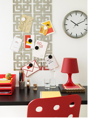
Using pattern to decorate building interiors has been practiced for centuries, and can be one of quickest and least expensive ways to revamp a space. If you love to use patterns as much as I do, or you just need some ideas of how to freshen up a room, here are a few design tips that are useful.
1.
This tip may seem simple, but it is important to know that a pattern is anything that repeats itself 3-6 times or more. Anything.
Photo courtesy of West Chin
Photo courtesy of Betty Wasserman Art & Interiors
Photo courtesy of Jean Pelle
These photos show that knowing what a pattern is can leave lots of room to be creative and generate interesting designs. However, it is very easy to get carried away when decorating a space with patterns, which brings me to my second point.
2.
A pattern draws a lot of attention, and is often the first thing noticed in a space. If there are many different patterns used at the same time, a space could seem overwhelming. However, that does not mean you can't break the mold of using one pattern for an entire space.
One way to avoid overwhelming a space with patterns while keeping the design interesting is to make sure that the different patterns have something in common: color, shape, or scale. This will help to unify the patterns. Here are a few examples:
Color
Photo courtesy of Better Homes & Gardens
(The wall and floor coverings of this bedroom have completely different patterns, but are similar in color which creates a sense of unity.)
Photo courtesy of OpenArchitecture.com
(The different floral patterns of this living area also share a color scheme.)
 Photo courtesy of Better Homes & Gardens
 Photo courtesy of Peter Dunham
Shape
Photo courtesy of Betty Wasserman Art & Interiors
(Notice that the prints of the window treatment, bedding, area rug, and chair pillow all differ in scale and color, but are all striped.)
Photo courtesy of Santiago Ortiz
(This bathroom has a combination of different materials: wood and tile. Both are different in scale and materiality but are linear in form.)
Scale
Photo courtesy of Southern Living
(The print of the upholstered chair and footstool differ in color and shape, but are of a similar scale.)
Photo courtesy of Heartfirehome.blogspot.com

Photo courtesy of Lars Contzen
As you can see, there are many rules of using pattern to decorate, and they are always broken in many ways. Some photos show patterns with color schemes not limited to one key shade. Others present extensive ideas of creating patterns not limited to fabric prints such as uniting different materials-wood, tile, or metal. Who says that you can't use a floral pattern with animal print in a space? You can if they share a color scheme or scale.
End Note:
I hope that this blog post has helped you turn the creative gears in your mind. If you have questions feel free to post a comment or email me at cocreateinteriors@gmail.com.
Related Post:
"Decor With Patterns Part 2: creating a focal point"


Love the explanation of pattern. Very detailed and really inspiring. Great use of examples as well. Keep up the great posts.
ReplyDelete